Other final projects
Design a Museum Display
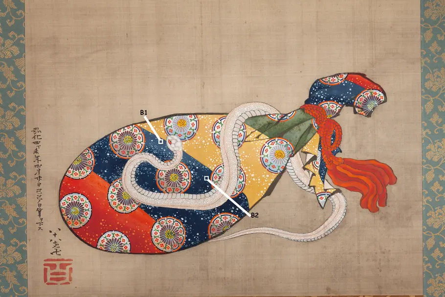
For this project, you'll design a museum display that conveys how light, color, and spectra are used in art conservation.Hokusai IR Imaging Part 2: Blue Spectra
Spectrum Tool. Let's revisit the spectra of ROI B1 and B2 that you saw in the previous section. Compare the spectra of the two blue pigments against each other and note their similarities and differences in visible light and in the infrared.
- Under the UNITS dropdown menu, select nanometers.
- Under NORMALIZE DATA, select visible to view the spectra only in the visible range. Identify 1-2 similarities and 1-2 differences between the spectra in the visible range.
- Under NORMALIZE DATA, select all to view the spectra in visible and IR. Identify 1-2 similarities and 1-2 differences between the spectra in the IR range (at wavelengths longer than ~700 nm).
- Adjust the WAVELENGTH STRETCH as needed to view the complete spectrum.
Spectrum Notebook. Complete the table and answer the questions in your notebook.
- Write the similarities and differences between the two spectra in your table.
- At what wavelength range (in nm) do you observe the greatest difference in brightness between the B1 and B2 regions of the painting?
- Imagine you wanted to know the composition of other blue regions in the painting, and you don't have access to a spectrometer to measure spectra for the other regions, but you can photograph the entire image using different colored (or IR) filters. Based on the differences in the spectra, which filter (in nm) would be most helpful for distinguishing which of the two blue pigments were used in other parts of the painting?

 Brightness