Other final projects
Design a Museum Display
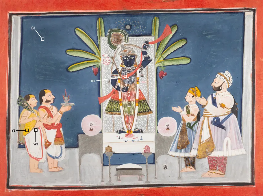
For this project, you'll design a museum display that conveys how light, color, and spectra are used in art conservation.Chokha Pigments Part 1: Spectra
Spectrum Tool. Compare the spectra of the regions of interest (ROI) with reference pigments of different colors to see if you can identify the ROI pigments.
- Under SOURCE 1, use the Select Chokha ROI dropdown menu to view a spectrum for each region of interest.
- Under SOURCE 2, use the Select material dropdown menu to view a spectrum for different pigments of each color or the cellulose background.
- Adjust the WAVELENGTH STRETCH as needed to view the complete spectrum.
NOTE: Many of the ROI and pigment spectra for different colors display absorption features at a common set of wavelengths: 1.39–1.67, 1.94, 2.11, 2.28, and 2.34 microns. These are contributed by cellulose in the paper that the pigments were applied to. The Chokha painting itself is also done on paper. A reference spectrum for cellulose is included, so you can account for its features in the spectra.
Spectrum Notebook.
- For each ROI, write the pigment names you identified in your notebook table.
- Some pigments may be easier to identify from their spectra than others. Use the last column to note how much confidence you have in your identification of the pigments for each ROI.

Source 1:
 Brightness
  Wavelength (microns)
 Source 2:
Brightness Wavelength (microns)